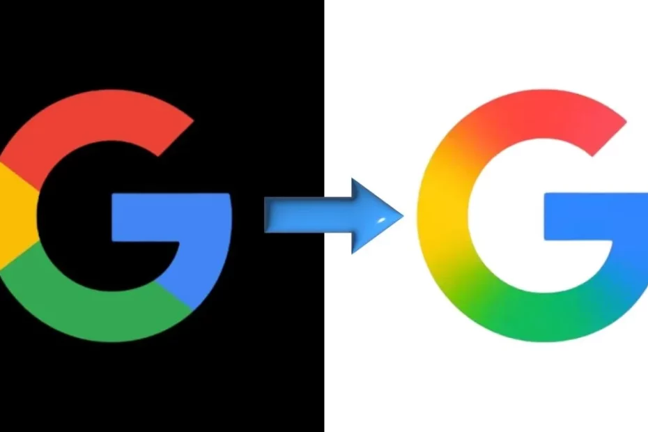
Google: After nearly a decade of visual consistency, Google has officially unveiled a refreshed version of its iconic ‘G’ logo, marking the first major update since 2015. The new look brings a subtle yet modern twist: instead of the solid red, blue, green, and yellow blocks that users have grown familiar with, the Google G logo now features a smooth, multi-color gradient that blends the tech giant’s signature hues into a seamless flow.
The gradient redesign represents more than just a cosmetic change — it aligns with Google’s evolving visual identity as the company leans further into AI integration, especially with the rise of Google Gemini, its generative AI platform.
What’s Different About the New Google G Logo?
The most noticeable shift is the gradient effect, which replaces the rigid segmentation of colors in the previous design. Now, the new Google G logo appears more fluid, vibrant, and dynamic — designed to feel more modern and adaptable across both light and dark modes.
Visually, the logo maintains its familiar circular ‘G’ structure, but the way the colors transition feels smoother and more in sync with the current design trends seen across Google’s AI-related products.
Where Can You See the New Logo?
According to early user reports and a 9to5Google breakdown, the updated Google G logo has already begun rolling out on select devices:
- Appearing in the Google Search app on iOS
- Spotted in the beta version 16.18 of the Google app on Android
- Visible on Pixel phones and limited devices running newer Google beta apps
On most other Android phones and in web browsers, the older segmented logo still appears. However, Google is expected to expand the rollout across platforms over the coming weeks.
Why Is Google Changing Its Logo Now?
This redesign isn’t just about looks. It reflects a broader shift in Google’s branding strategy, particularly around AI and machine learning technologies. With products like Gemini AI now front and center in Google’s ecosystem, the company seems to be adopting gradient-based aesthetics that mirror the branding of Gemini — which already features a distinctive blue-to-purple gradient.
The new Google G logo acts as a visual bridge between old and new, maintaining familiarity while pushing the brand toward a more dynamic, future-facing identity.
Will Google Update Other Logos Too?
So far, Google’s main wordmark remains unchanged, and there’s no official word on whether logos for other services like Chrome, Gmail, or Google Maps will adopt the gradient look. That said, the company’s increasing emphasis on unified design language suggests that we could see similar updates across its product suite in the future.
What This Means for Users
If you’re seeing the new Google G logo on your device, you’re not imagining things. This change is part of a gradual global rollout, which means more users will begin noticing the update soon. While it may seem like a minor tweak, it signals a significant branding direction as Google continues to evolve with the age of AI.
